
15. May 2023Insight
The new GoodRequest website: a combination of advanced design and state-of-the-art technology
After months of hard work and testing of new technologies, after endless feedback rounds and tweaking the smallest details, the GoodRequest website saw the light of day in a new outfit 🎉.

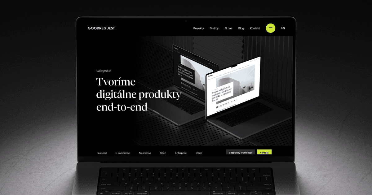
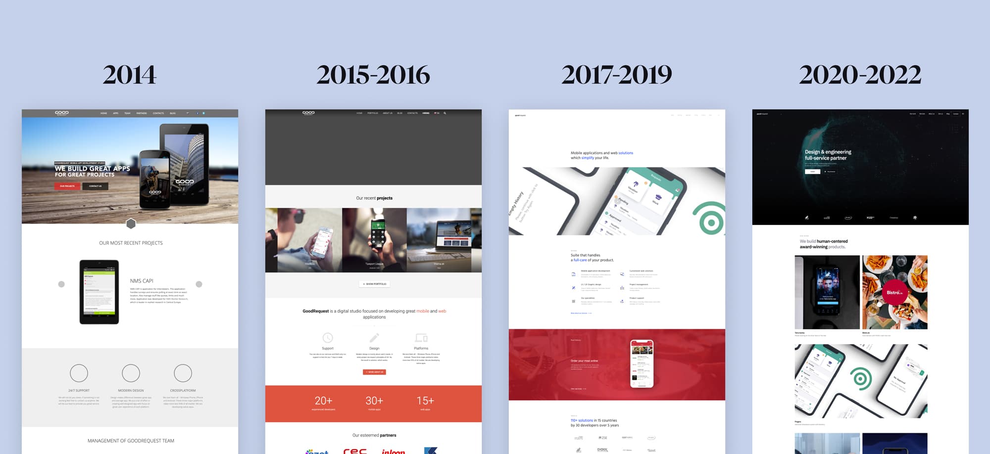
Over the past 10 years, we have replaced several versions of the website (more precisely, 5 😅). Although it sounds like a lot, our industry is developing fast and constantly brings new challenges and opportunities to which we must respond. After all, as a digital studio, our website must adequately represent us. However, we are convinced that our current solution is sustainable in the long term, both in terms of technology and design.
The website finally makes full use of our serious but "fresh" identity as well as the latest technologies from our frontend tech stack. But why did we decide to change and how did we proceed?
From Webflow to a custom website
We created our previous website on Webflow, which is primarily intended for the creation of smaller presentation pages. Although the transition to Webflow in 2020 brought us many advantages, we gradually realized that even this platform has its limits. As our business grew, we reached a point where Webflow could not meet all of our requirements and needs. We have selected the biggest pain points for you.
From the point of view of marketing, they main concern was CMS, which limited us both in terms of creativity and operative service. The editor interface could not handle simultaneous work even with two users, and certainly not with the work of an editor and a developer/designer at the same time.
As for development, the environment was difficult for developers to work with, it was unstable and many times it behaved in unpredictable and illogical ways. At the same time, we realized that even small adjustments take a lot of time and energy. We have also selected a few "tastings" for you, with which we fought 👇.

Redesign: evolution and revolution hand in hand
There were several reasons why we decided to change the design of our website. One of them was that we wanted to get as close as possible to our community and partners. That's why we conducted a series of interviews where we got the feeback from the target audience and found out what is important to them and what they expect from our website.
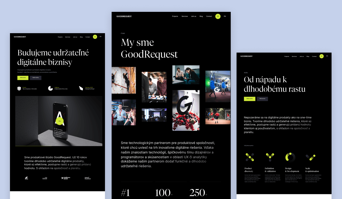
Another key reason was that when implementing the new brand, we did not fully utilize its potential on the original website. Rather, it was about fine adjustments, where we changed the typography and applied new brand colors. As the saying goes, the shoemaker's children walk barefoot. We therefore decided to devote enough time to the new proposal and go through many rounds of feedback together. The result was a design that perfectly communicates who we are. It is sufficiently serious, but at the same time modern and fresh, and represents the ideal ratio between professionalism and progressiveness.
In our initial interviews, we found out that the Home page, Services, About us and Contact are the pages that interest our partners the most. Until now, these pages did not reflect our current direction, and they did not think at all about our future direction vision. That's why we decided to start a complete "overhaul", not only in terms of design, but also in terms of content. We started on a "blank page", where we first set content goals so that we could then deal with the design page.
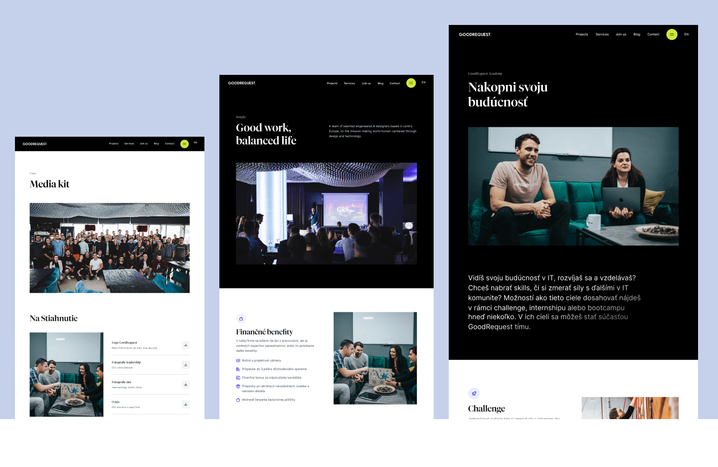
On the other hand, "only" evolution - minor changes - was sufficient on several subpages. The sub-pages were either recently created or simple and straightforward, so we flipped them over to the new brand, taking into account the requirements mentioned in the introduction.
A website not only for business but also for the community: Content & Events
Since GoodRequest was founded, working with the community has been key for us, which includes creating quality content from experienced authors. Our blog has long been (in all modesty) one of the most active and high-quality in the field of technology and design.
We realized that our original solution limited our creativity and ability to effectively present high-quality content. As a result, we have not been able to deliver our message to the audience in the quality they deserve. We are all the more looking forward to all the news that will make our blog even better! We have come up with several improvements that will significantly improve the user experience.

A website built on solid and modern foundations
What else makes the new site so interesting? The magic is hidden "under the hood". The website runs on the most "in" technologies at the moment. If you move around in the world of technology, you've definitely heard of buzzwords like Next.js, Strapi, Vercel, Serverless and Edge functions. These advanced technologies allow us to provide a seamless, lightning-fast user experience while maximizing scalability.
Not only beautiful but also fast
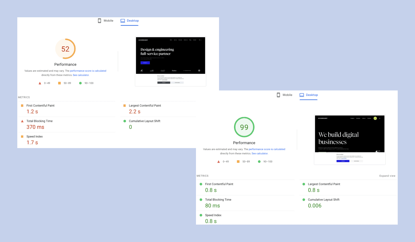
And the fact that the new website is not only beautiful, but also technologically tuned, is probably the best proof of the comparison of scores in Google Page Speed Insights (which is the industry standard for measuring web performance), where we jumped from values around 50 on the old Weblflow on the desktop web at an almost perfect 99 🎉. However, we are not done here, we are still fine-tuning the last details in order to reach the magical hundred.
The creation of a new website was certainly not easy. As usual, GoodRequest was the most demanding "client" for itself. After all, we will not settle for something that does not meet our own standards.
The result is definitely worth it and we are proud of the new website, both visually and technically. Of course, we are still fine-tuning the details to make the overall web experience as good as possible, whether it is copy, animations or speed of the web.
We will be very happy if you tell us your opinion about our new website 🙂


Related articles

The Digital Experience in Insurance: From Passive Contracts to a Useful Tool

#grpartners: bringing a new perspective on the customer journey and software development at O2

Year 2025 at GoodRequest
