Improving internal communication for the employees of Kia Slovakia car plant
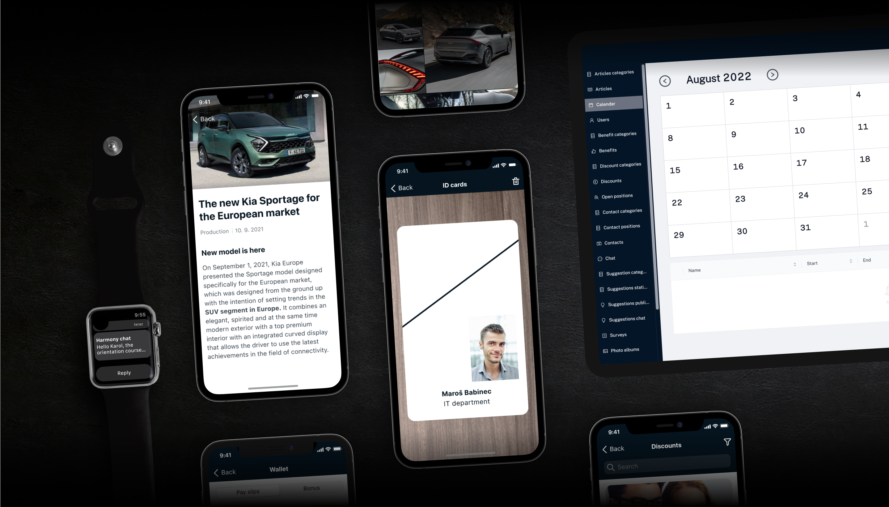
We created an internal communication app for over 3700 employees of Kia Slovakia.
Informations
- Client: Kia Slovakia
- Project type: iOS & Android & HarmonyOS applications, web admin
- Services: Design, development, testing, project management, support
- Year: 2022
How to improve internal communication and employee satisfaction.
After the successful 360° feedback tool project for Kia Slovakia, they contacted us with another cooperation proposal. By developing a native iOS & Android & HarmonyOS application, which should serve to improve communication between the company and employees and increase employee satisfaction by bringing all important information into one application. Based on the analysis and finding out many user problems, we decided to redesign the existing design from an external company without increasing the budget.
Goal: Improve communication between management and employees with a focus on ecology.
The main goal of the application is to make communication between management and employees more efficient. Focus is also placed on ecology, as information leaflets and payslips have been printed for many years and then distributed to employees. This outdated approach is still standard in many companies, but it is very inefficient. Preparation, printing and distribution take a lot of time and the result is still very weak because such announcements remain unnoticed. Kia aimed to change this and create direct communication with employees, which we managed together in the end.
You will learn:
- Why we decided to redesign the existing design without increasing a budget
- How we design 8 apps into one
- How we made the app accessible also for people with color blindness
- Notifications are not easy as they seems to be
Client
Kia Slovakia is one of the largest employers in Slovakia. The modern plant in Žilina produces more than 300,000 cars a year, which are exported all over the world. Car production is a complex process that requires a unique organization of the entire production chain. But behind every step, there are people. There are currently more than 3,700 people who perform their tasks every day, occasionally solve unexpected problems or just casually discuss over lunch in the canteen.
Challenge
The biggest challenge of this product was the diversity of the application. Although we initially thought it was a simple internal application for employees, the design of the information architecture convinced us of the opposite. The application consists of more than 8 supporting functions that we could consider as individual products.
Quality does not compromise
At GoodRequest, we care about making our work meaningful and that its results help make the world a better place. As the company, we do not want to stand for a product that does not bring value to the user and does not meet the client's expectations. At first glance, we found many user errors in the design, so we decided to do an in-depth analysis. In the analysis, we checked the client's requirements and the user experience.
- One of the client's main requirements was native development, but the design did not meet Google Material Guidelines or Apple Human Interface Guidelines.
- The design was not scalable, it would not be possible to build on it in the future.
- The design did not meet the basic accessibility requirements - the color scale was not adapted to people with a color vision deficiency.
- The original designs were out of date and incomplete – the defects would be revealed during development and would cause significant cost increases due to rework and modifications.
- The design system did not exist.
Build to last
One of our values at GoodRequest is Build to last. So we make our products in such a way that they stand the test of time, are well scalable and sustainable. Therefore, we could not develop a product that did not meet these requirements and would cost the client unnecessarily a lot of money in the future. That's why we put our heads together and presented the design in our interpretation to the partner so that it met the requirements, was scalable and, last but not least, improved the user experience of the employees. We thank Kia for showing us great confidence and allowing us to take this step without hesitation.
Clearly defined requirements
To start the project in the right way, we had to be sure we fully understood the client's requirements and expectations. That's why we organized a series of meetings where we discussed each request in detail. We asked what its added value is, what problem it solves, whether it is important for the employee or the management, and we brainstormed its use and connection with the remaining requirements.
Clearly defined requirements and goals are a certainty for us that we are on the same page with the client and heading in the right direction.
8 applications in one
After defining the client's requirements and initial research, we moved on to design. As we mentioned above, the design of the information architecture of this application was not easy at all. We had to work out with the leaders of the company's different departments what information is the most important to their employees. Based on these decisions, we prioritized the functionality of the application. The application consists of several smaller applications that the user can use. You can read about the individual applications below.
The dashboard belongs to the employees
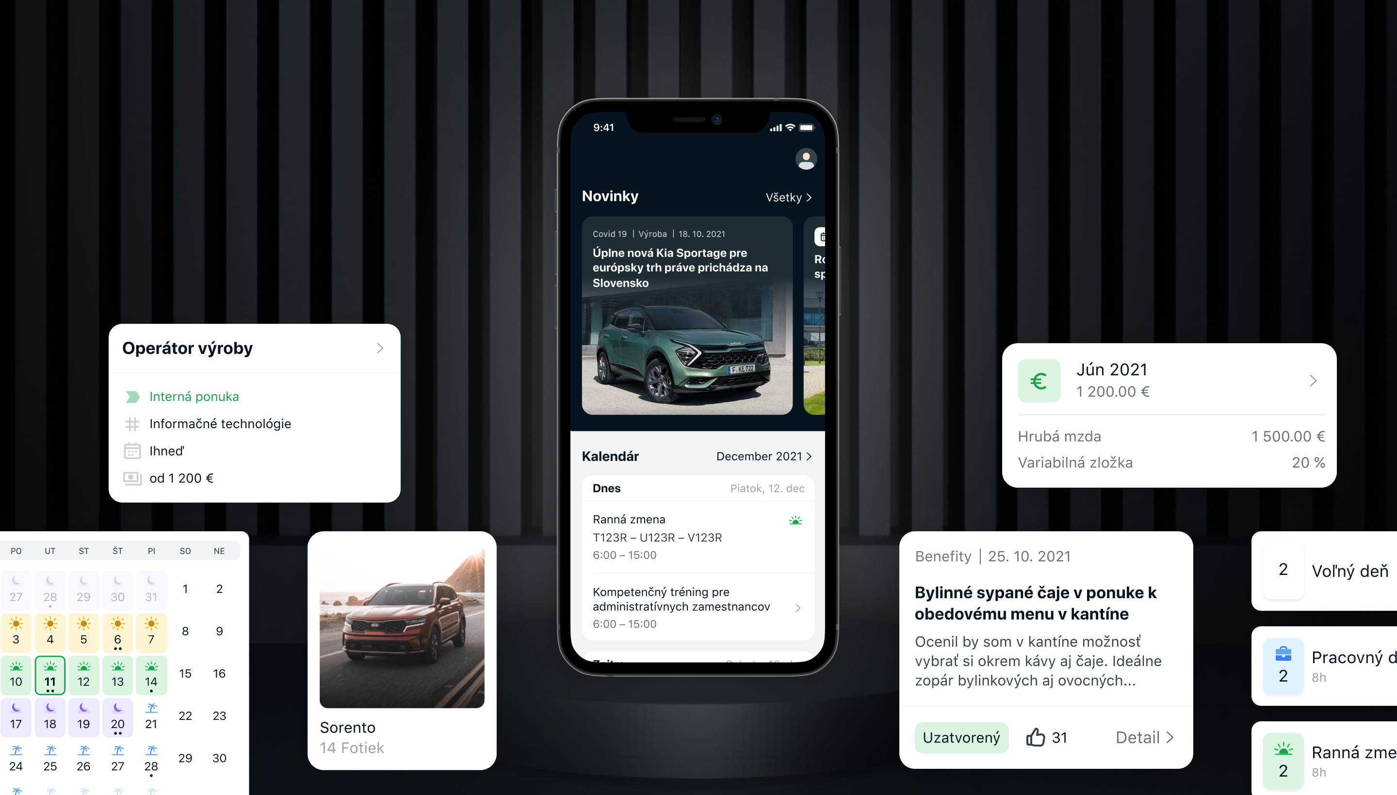
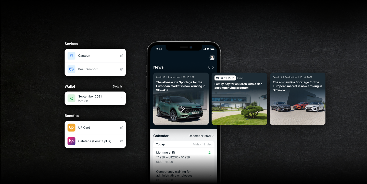
All the important information that the user needs is primarily on the home screen. The user can see the news and calendar without scrolling. The user sees the news to stay in touch with what is happening in Kia Slovakia, the calendar is available with today's and tomorrow's change, or with the event that is taking place these days. The operator also has information on which exact position he will work during the individual thirds of HQS. We have placed the services that he uses every day, such as the canteen and bus transport, just below. Payslips have been highly requested by our employees, but due to interaction only once a month, they are in the fourth position on the home screen. Finally, the user sees the benefits that he can use as an employee of Kia Slovakia.
Suggestions - Have you ever heard of the Japanese Kaizen philosophy?
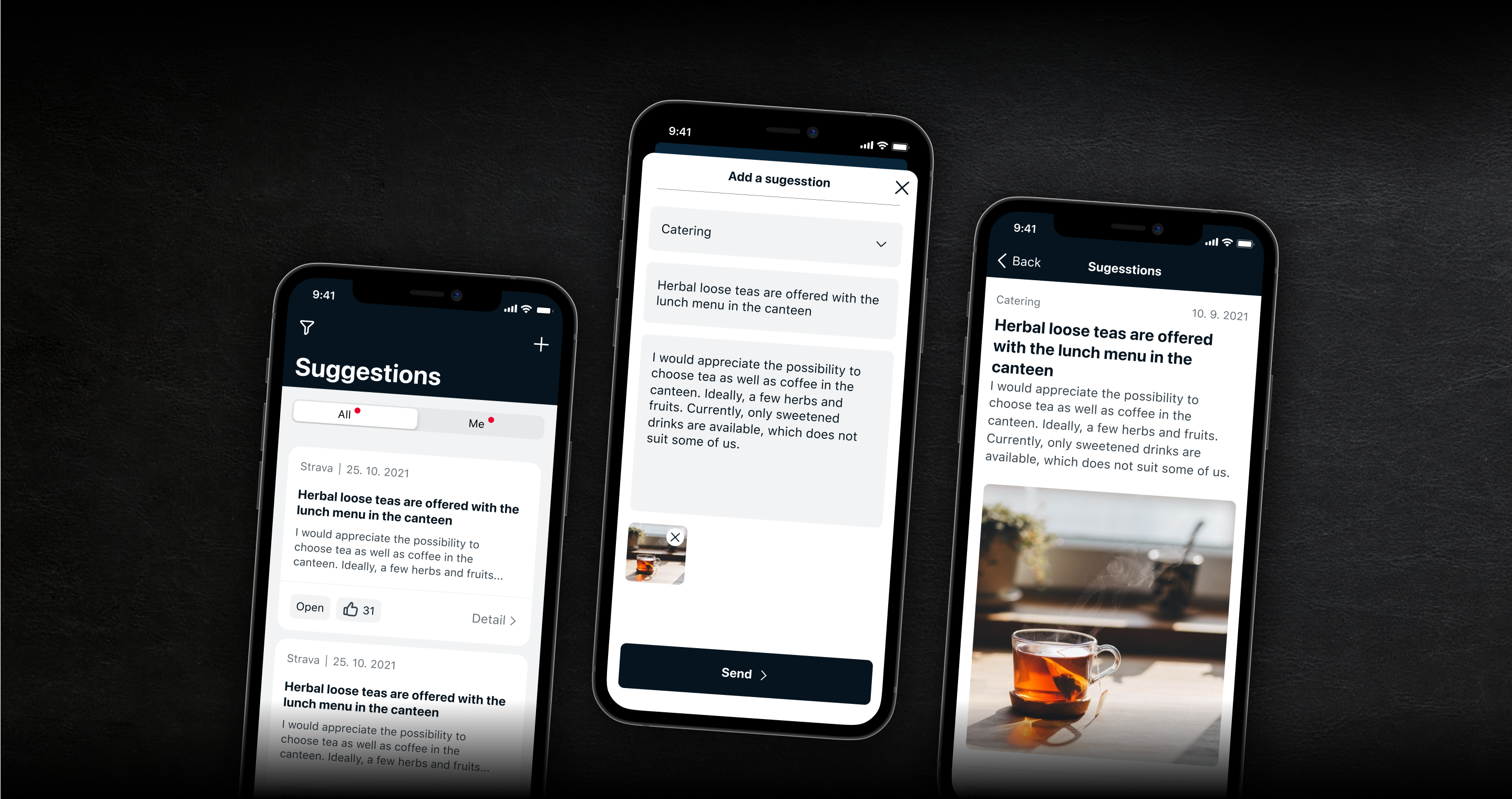
Kaizen is a Japanese philosophy aimed at continuous improvement in all areas of life. When applied to the workplace, Kaizen continuously improves all aspects of business, from production to management and from the director to the assembly line workers. We transferred this philosophy to the application in the form of Suggestions in the main navigation. Every employee in the company, regardless of their position, has the opportunity to write a suggestion that would improve their working environment or their everyday life in the company. Employees can like suggestions, which gives management a review of what employees want and need. This philosophy usually results in small improvements, but a large number of small improvements brings big results in overall productivity increase.
Calendar - Design also for people with color vision deficiency
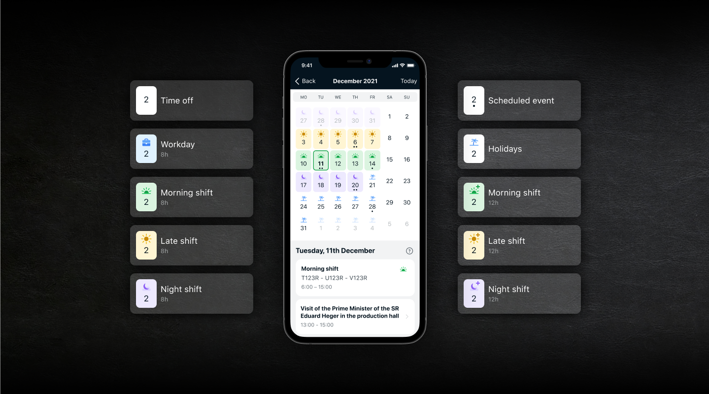
Morning, lunch and night shift. It can be 8 or 12 hours. Administrative employees who work from 7:00 a.m. to 3:30 p.m. Paid vacation or company leave and events organized by the company. All this information had to be displayed in one calendar as simply as possible, so that the user could distinguish them at first glance without needlessly clicking through to the details. The best choice when displaying a large amount of information on a small surface, such as a calendar, is simple iconography and the use of colors.
According to Clinton eye, 1 in 12 men and 1 in 200 women suffer from some form of color vision deficiency. With 3,700+ employees, we have to take into account that the application must also be usable for these people. That's why we designed all the colors in the app to be visually recognizable for every user. We used this tool for verification.
Contacts
Getting in touch with HR, the shift manager or contacting the emergency services couldn't be faster. Thanks to the Contacts function, the user can easily and quickly search for the necessary contact and have their e-mail or phone number in a few seconds. The search is also speeded up by the search bar and the filter, where the user can filter contacts by department.
Harmony chat
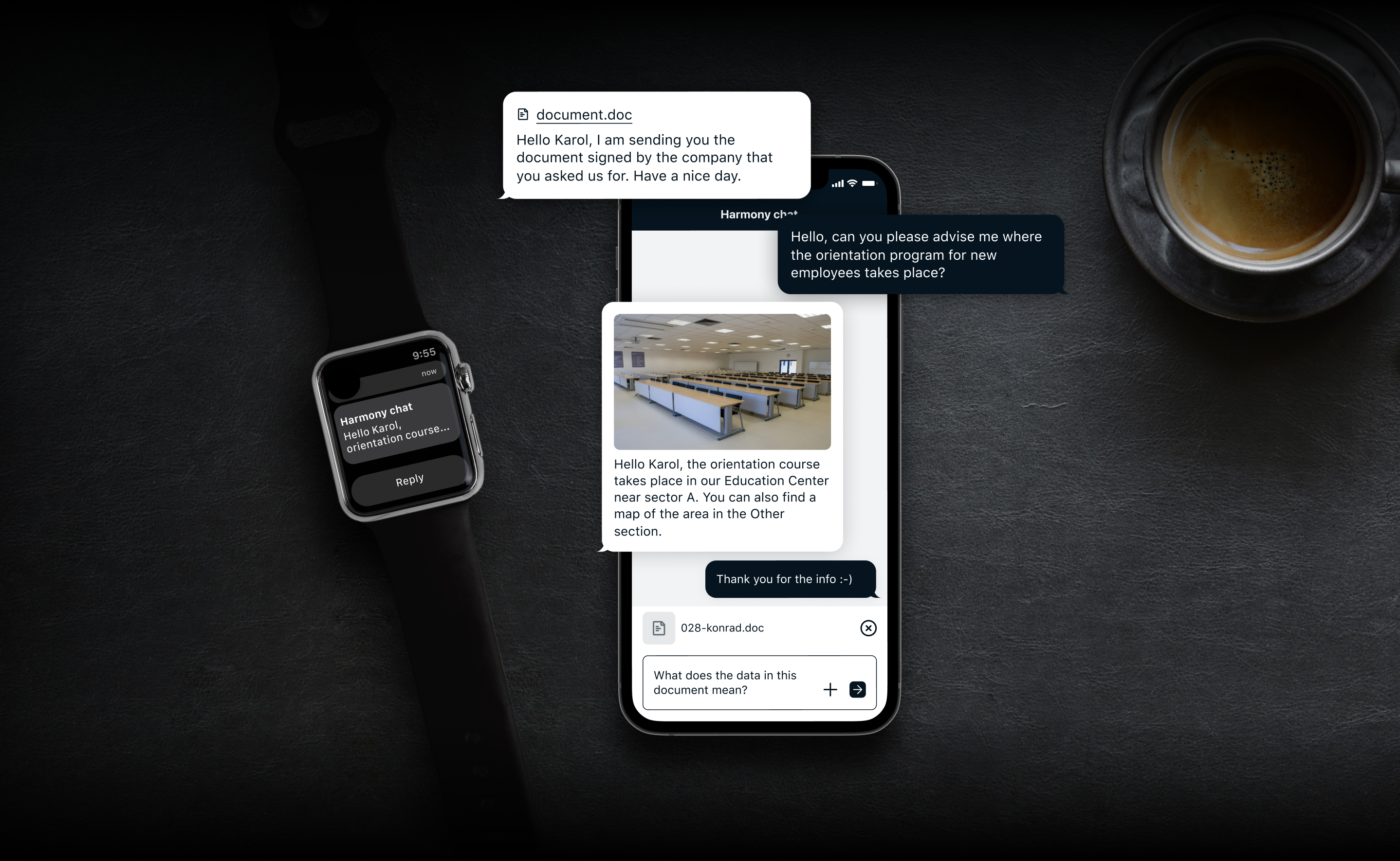
One of the main goals of the application is to improve communication between management and employees. That's why we've added Harmony chat to the app, where every employee can get in touch with the Harmony advisory section with their comments, suggestions for improvements or questions. With this chat, we have transferred Viber, e-mail, phone calls or knocking on the door into one tab.
Podcasts and radio
The Kia company cares that employees feel good in the company, that they feel that they are a part of it and that they are not just treated as workers. That's why Kia created its own podcasts and radio for them. In the podcasts, they can listen to interesting interviews with special guests, news from the world of Kia, but also news from the automotive industry or technology. The Kia radio makes their Friday shifts more pleasant.
Wallet - all salaries together
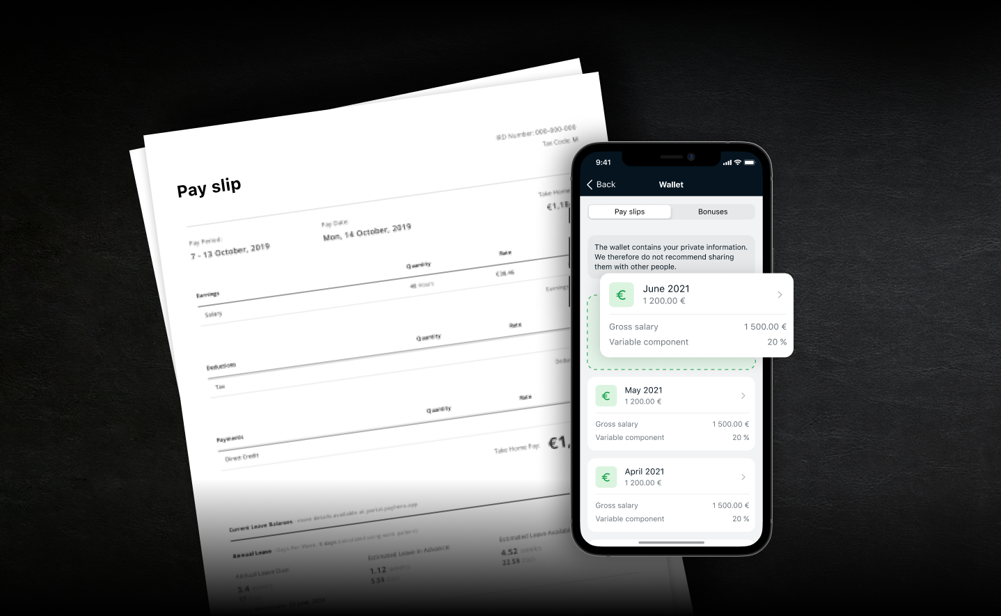
The wallet is the result of one of the main goals of this application. For the employer, it replaces the printing of most payslips. For the employee, it is a place where he has all his payslips together and it will no longer happen to him that he "lost" one somewhere.
Employee safety is primary. In order to prevent the pay slip from falling into the hands of someone else, the user must undergo an authentication process before entering the wallet - FaceID, TouchID or 6-digit PIN.
Gallery, questionnaires, job offers and much more
There is much more in the app. The user can view the gallery, and for potential employees, there are job offers that are also visible to the public. The employee can participate in competitions, use discounts in stores or check the lunch menu.
Administrative environment
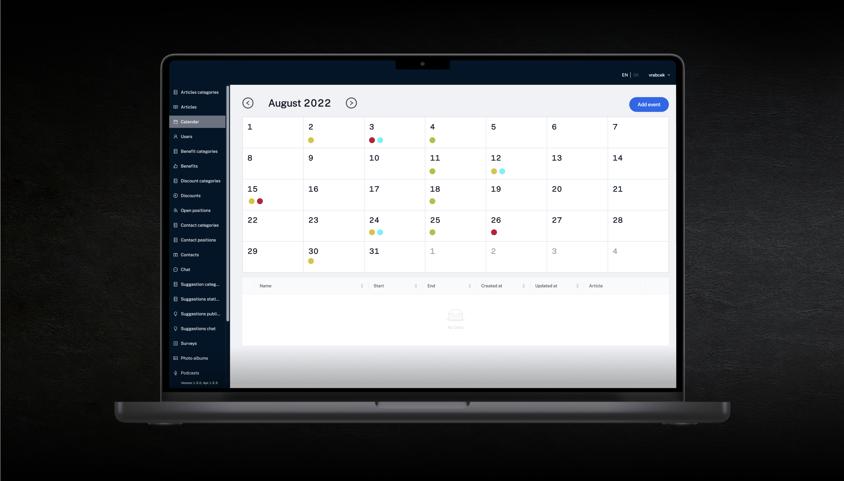
As the application is an information platform for employees, there must be someone in the background to manage it. Therefore, the creation of an administrative environment was an integral part of this project. It is a web application designed for making and processing content for employees. One of the most important functions is targeted notification - notifications intended only for a certain group of employees - e.g. paint shop department.
SCRUM
The guarantee of achieving high product quality is a correctly chosen work procedure. For a project of this size, diversity and time intensity, the best practice is SCRUM, an agile method of project management. Thus, the employees can solve complex dynamic problems while productively and creatively delivering products with the highest possible value for the user. While working in SCRUM, the pressure in the project environment is much smaller, people in the team know what their role is and the client knows how the whole process works.
Development
From the beginning, we grasped the development very thoroughly and responsibly. We faced several challenges during development. One of them was the "Chat with users and chat administration" functionality from the side of administrators. Another challenge was ensuring communication between the application and the Backend, which is internally under the client's secure network. It required trying several setups before we found the best one. We created a secure communication between BE and the Application so that it is not possible to leak pay slips and personal information. Another challenge was the notifications, which taught us that even such a clear request requires a more detailed analysis. We released the product gradually. We made the first release just before Christmas 2021. A beautiful gift. Then, two months later, at the end of February, we delivered the most complex "chat" functionality with other minor functionalities.
Results
The biggest factor that shows the success of an app is the number of users. The engagement rate is 85%, so almost every employee of the company has downloaded and is using the application. Such a high number exceeded our and the client's expectations, which makes us very happy. Kia confirmed that the application made their communication with employees more efficient and faster, especially in times of a pandemic and economic crisis, which leads to shortages in the supply chain. Information about current events, the production plan or possible shutdowns will reach the employee within a few seconds. By displaying benefits, discounts and advantages, or informing about various events and competitions in the company, we increased employee satisfaction and loyalty.
Last but not least, the application contributes to ecology and the reduction of financial costs, as pay slips, announcements or any other documents no longer need to be printed.
The cooperation does not end
Our cooperation with Kia Slovakia did not end with the application handover. We are constantly managing the application, solving bugs if any occur, and we are already planning additional functionalities together with the client in order to contribute to employee satisfaction with the application.
