Introducing a feedback tool to thousands of employees of Kia Slovakia car plant
Feedback Tool for thousands Employees from Kia Slovakia
Informations
- Client: Kia Slovakia s.r.o.
- Project type: Web application
- Services: design, development, testing, project management
- Year: 2021
Feedback from every point of view
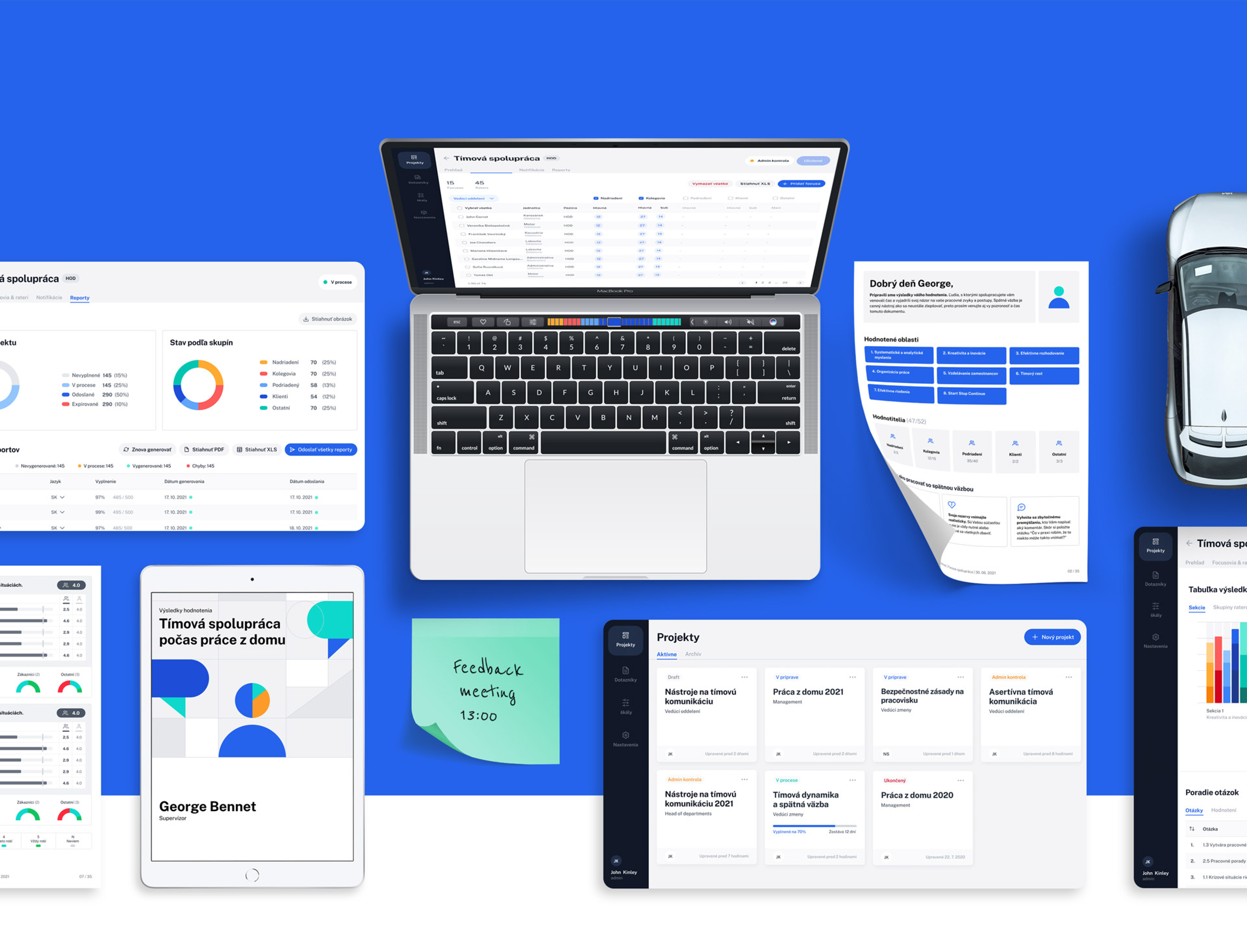
At GoodRequest we have been given the opportunity to develop a feedback platform for Kia Slovakia. The universal tool enables the HR department to create, manage and evaluate anonymous questionnaires much faster than ever before. The system is developed with regard to user needs, maximum comfort and efficiency in filling, with an emphasis on understanding the results of evaluation. The overall result is a shortening of the filling time and an increase in the quality of the feedback.
Key findings:
- How we turned the brief into user needs
- How to design easy-to-read graphs
- How the prototype was tested remotely
Partner
Kia Slovakia is one of the biggest employers in the region. The modern factory in Žilina produces more than 300,000 cars a year, which are exported worldwide. Car production is a complex process that requires extraordinary organization of the entire production chain. There are, however, people behind every step. Currently, more than 3,500 people from different countries perform their tasks on a daily basis, solve unexpected problems or just have small-talk during their lunch in the canteen.

Challenge
It is people and their opinion on the work environment that is a valuable source of information, thanks to which the company moves forward. Kia has used various platforms to get feedback, but decided to create its own solution that meets their exact requirements. They therefore approached GoodRequest to design and develop a simple and secure platform for delivering and evaluating comprehensive feedback.
Minimum viable... plan
At the very beginning of the cooperation, we defined the scope of the project together with the client based on technical possibilities, time and budget. We decided to start with a version of the minimum viable product (MVP), i.e., a product that contains only the most necessary parts that bring the desired value to the user. This approach allowed us to develop the platform in a relatively short time and with a budget that was not wasted on complex functions with uncertain value.
At GoodRequest, several roles have been cooperating, from the very beginning. Roles such as: project manager, designer, backend and frontend developer, and testers. This approach is very effective because it reduces misunderstandings and unnecessary communication between individual team roles. Everyone knows what to do and when to do it and at the same time understands what everyone else is working on. This form of team coordination allowed us to work simultaneously on the preparation of backend databases and platform design, which saved us a considerable amount of time.
In addition to effective cooperation, a value that is important to us is transparency. The client had access to the project roadmap, so he could check at any time at which stage of development we were at that moment. The client had also access to designs where he added comments and could follow the incorporation of his comments. The client experienced the so-called "Demos" - regular demonstrations of ready-made platform functionalities.
From assignment to user needs
We received a specified assignment from the client, which set the boundaries of the research. As with any project, we started with a kick-off meeting, where we profoundly explored the problem and we tried to understand the client, his needs, motivations for changing the system and, last but not least, setting expectations of success. We continued with the audit of the solutions used so far and the required functionalities. GoodRequest directs product design using the “Design thinking” method, which means that the whole process has a clearly defined procedure: empathize with the user, define the problem, look for a solution, and finally test it through a prototype. The next logical step was to transform the list of functionalities from the assignment to the needs of the people who will work with the platform.
Considering that a wide range of employees will come in contact with the feedback platform, it will be necessary to map and define basic personas. A persona is a typical example of a user who performs similar tasks while working with the platform. Based on these tasks, we defined 3 personas:
Platform administrator - creates questionnaires in the editing interface, manages and evaluates projects, processes data outputs.
Rated - an employee who is evaluated by his surroundings. Finally, he has access to the results of his evaluation in the form of a PDF report.
Evaluation group - people who pass on feedback to the evaluated colleague via a questionnaire.
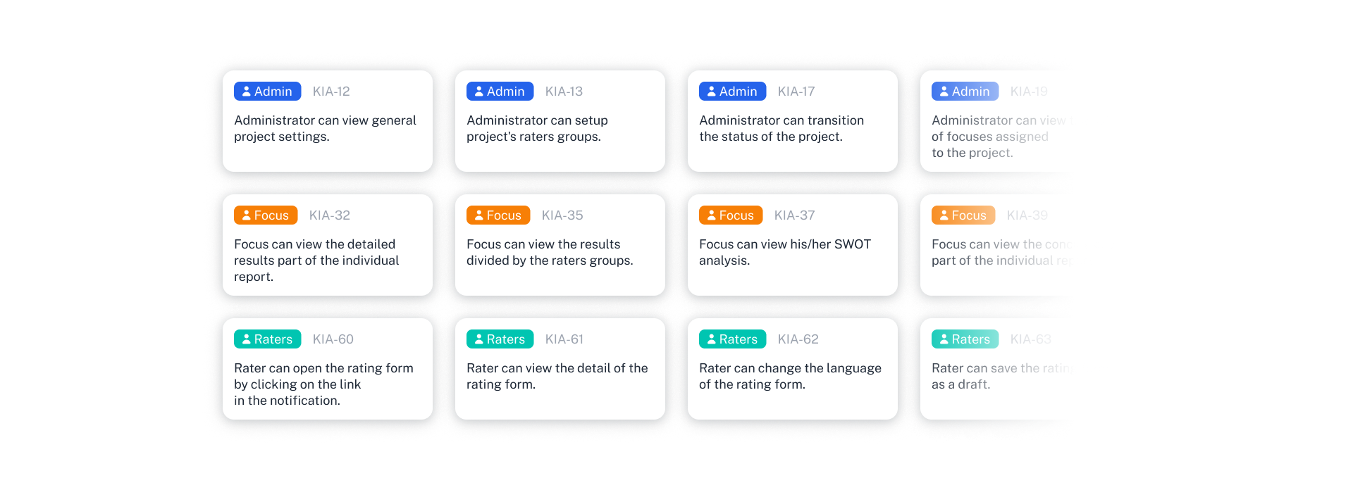
For each persona, we defined their needs and requirements based on interviews with the client and his specifications. We subsequently transformed the requirements into so-called User stories. The User story represents the functional requirements of the system from the user's point of view. This approach helps us look at design and development through the eyes of people and their needs, not just through the lens of technology.
Wireframes
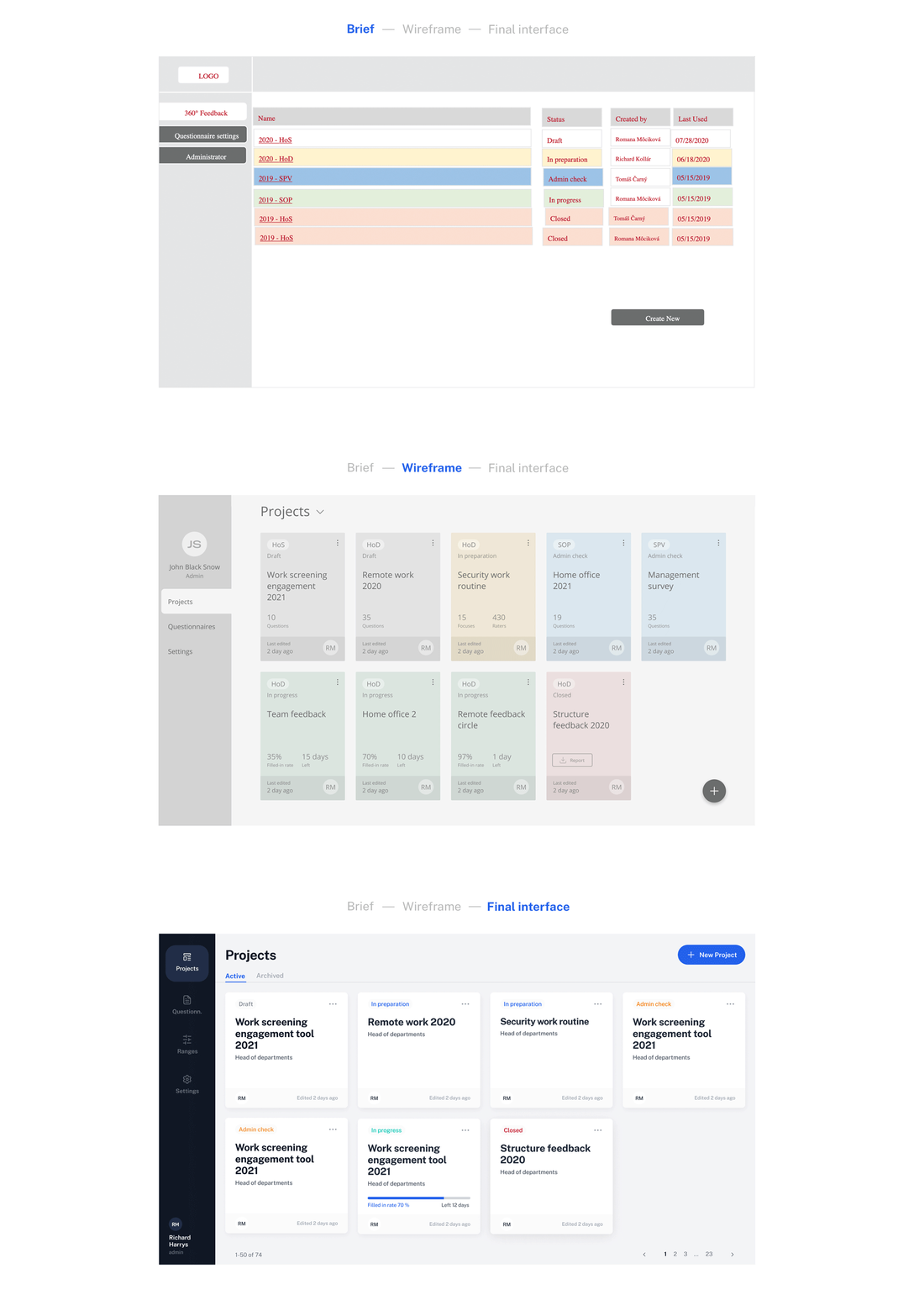
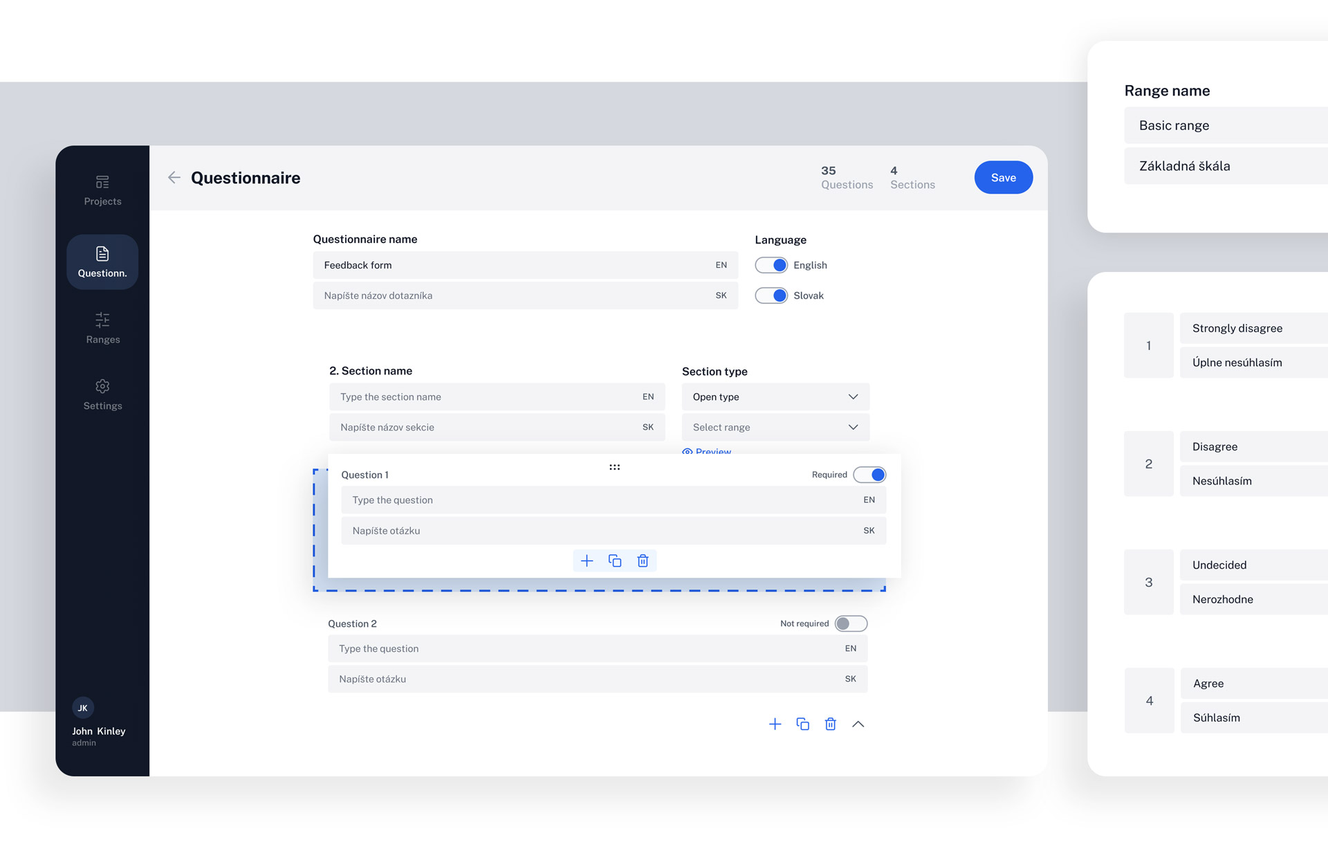
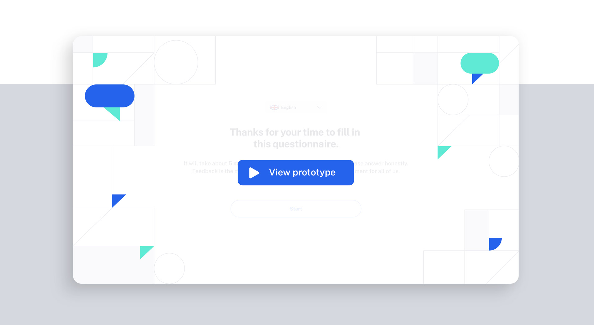
Sketching is a great and quick helper when placing content on individual screens. Subsequently, we created a simple clickable prototype to verify that the user scenarios make sense and that the required functions are arranged in a logical order. Wireframes then underwent internal feedback and the first usability testing.
Interface design
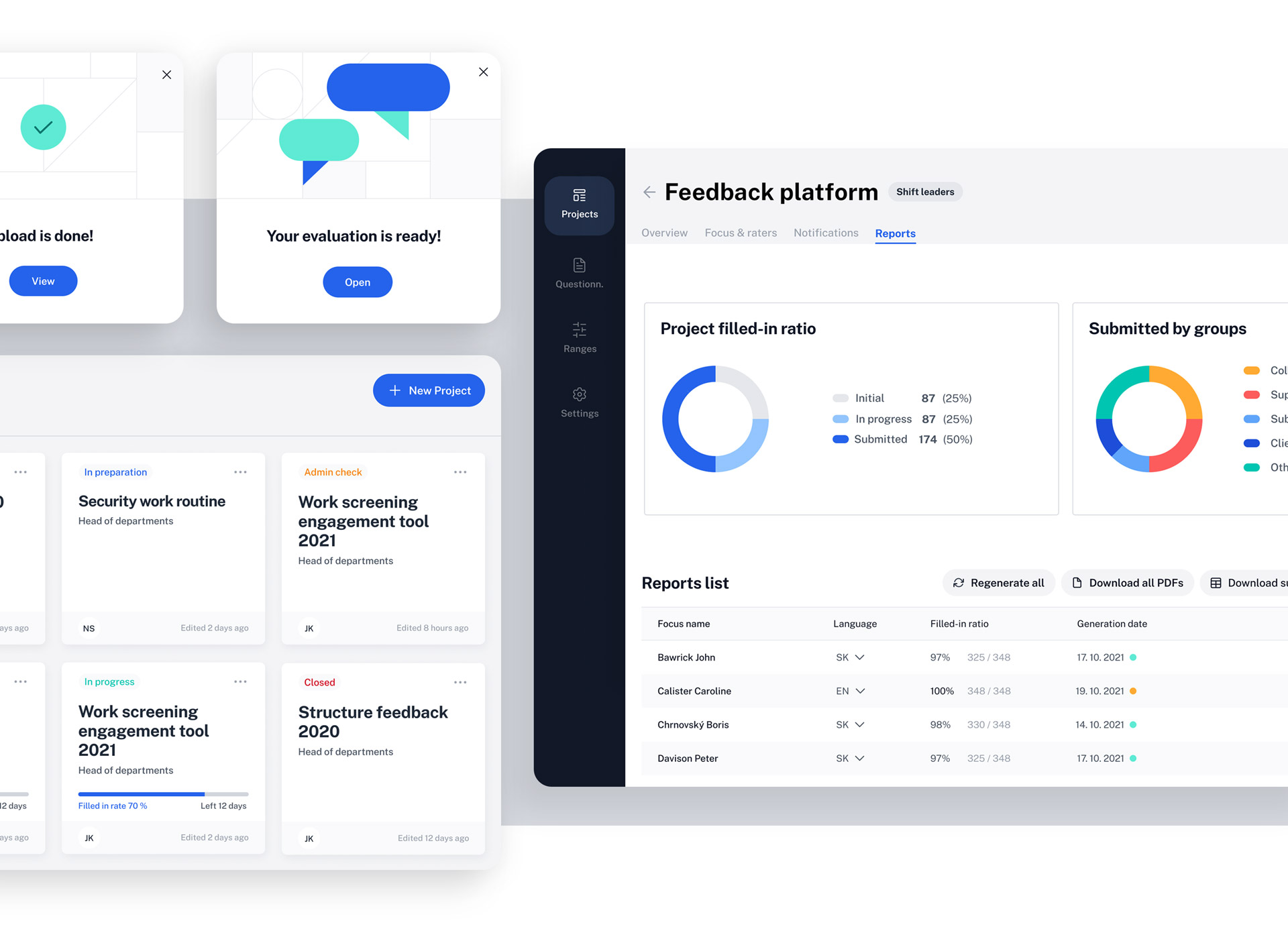
In this phase of the project, we were looking for a suitable visual language for the platform. As it is intended to provide sincere feedback, we wanted to create a safe place where employees can freely express their views. At the same time, the neutral color palette of the interface leaves room for the diverse range used in graphs and infographics in the PDF report.
Feedback hidden behind numbers
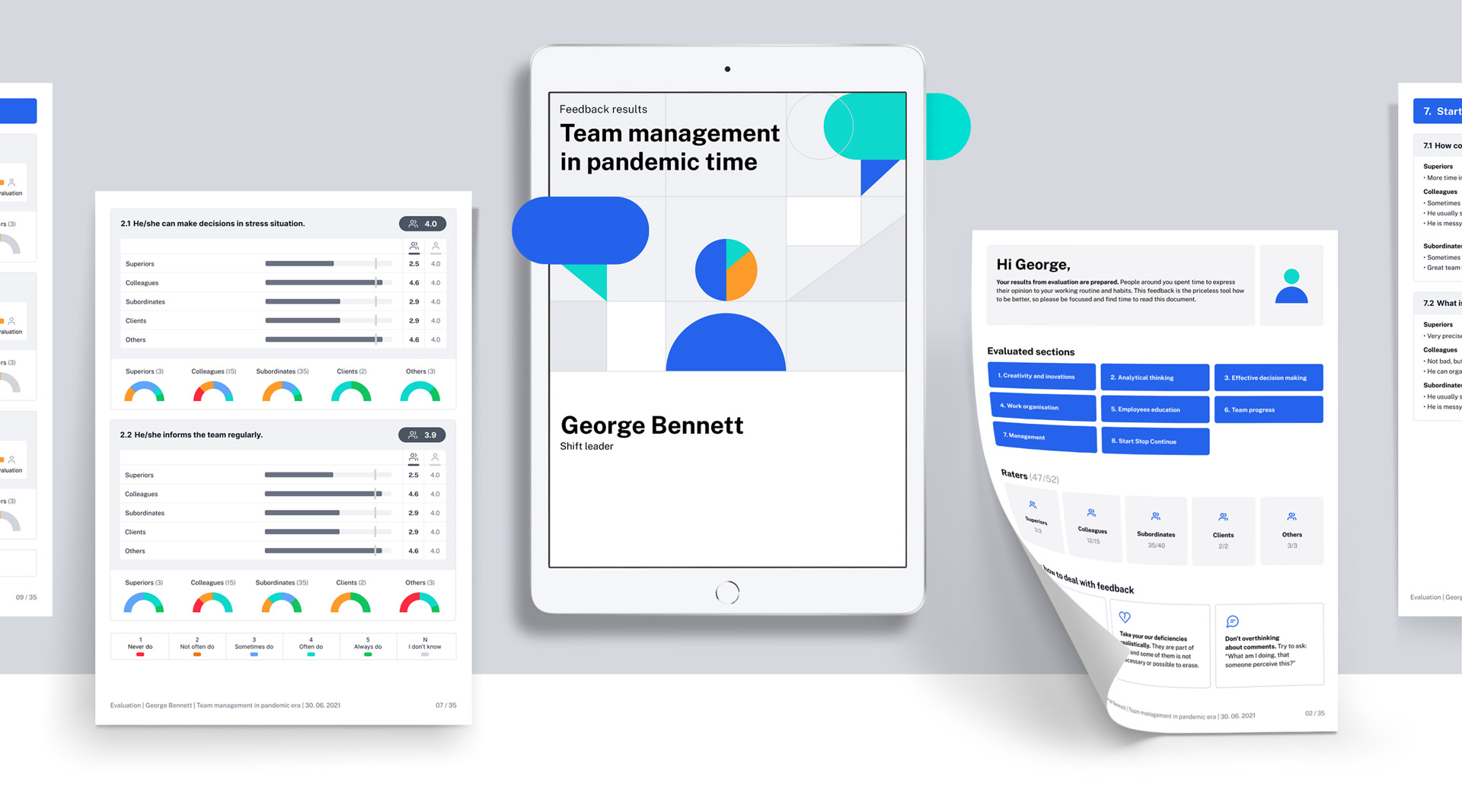
The output of the evaluation is a PDF report with summary but also detailed results. The document contains a whole range of graphs, comparison tables and verbal evaluation. Our goal was to present this tangle of information to the evaluated person as clearly as possible. Therefore, each part of the report contains help that explains the individual parts. This saves time, especially for the HR department, which does not have to explain complicated graphs to the employee at the final evaluation meeting. On the contrary, it creates a space to discuss together the meaning of the data for his personal development and business.
The evaluated people are from different age and working groups. At GoodRequest, we always strive to create a design that is accessible to all users. It was therefore important to set the correct font size and contrast to make it easy to read across the platform. Also, the color palette used for charts and infographics is distinguishable for people with color vision disorders.
Online testing
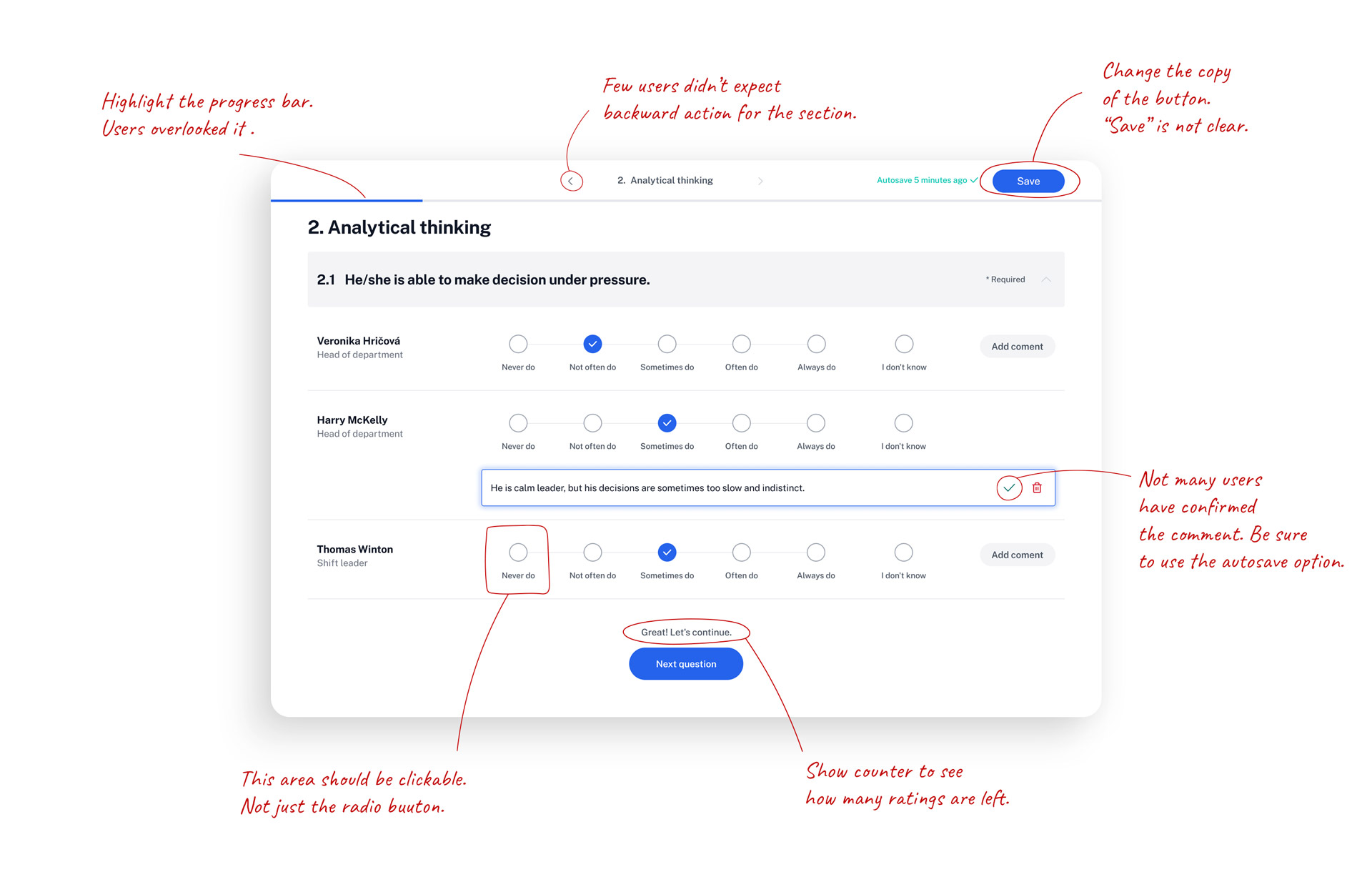
User testing was the last stage in the design. It's an easy way for us to verify the correctness of our hypotheses and decisions.
Due to pandemics, but also different locations of users, most testing takes place online. It takes a little more planning than a live meeting, but in the end, it saves time of everyone involved. During the testing, we always record the screen as the user interacts with the clickable prototype of the application. In the same way, if the conditions allow, we also record the user himself. Non-verbal communication sometimes says more about a person than a thousand words. The records are only used to evaluate the test if it is repeatedly necessary to go back to the problem parts. Our UX researcher and testing specialist is in charge of the testing and evaluation. During testing, he also assigns tasks to users, then helps navigate the prototype and asks additional questions.
Development
One of the biggest advantages of GoodRequest is the comprehensive design and development of digital solutions all at one place. In this project, we have transformed more than 7 years of experience into a selection of the most suitable technologies and frameworks. The development of the project was guided by the Agile SCRUM methodology from the beginning to the end. On a regular two-week basis, we submitted the completed part through a meeting called "Demo". During the presentation, we heard feedback and, if necessary, incorporated adjustments.
Our team consisted of 8 members. One designer, two back-end developers, three front-end developers, one tester, one half of analyst and one half of project manager.
As part of the communication, we mostly used the Slack platform. We delivered the client a product that met expectations and something more, professionalism, helpfulness, trust, safety and an excellent feeling from the work done. We managed the project and deployed it according to the client's requirements.
Testimonial
