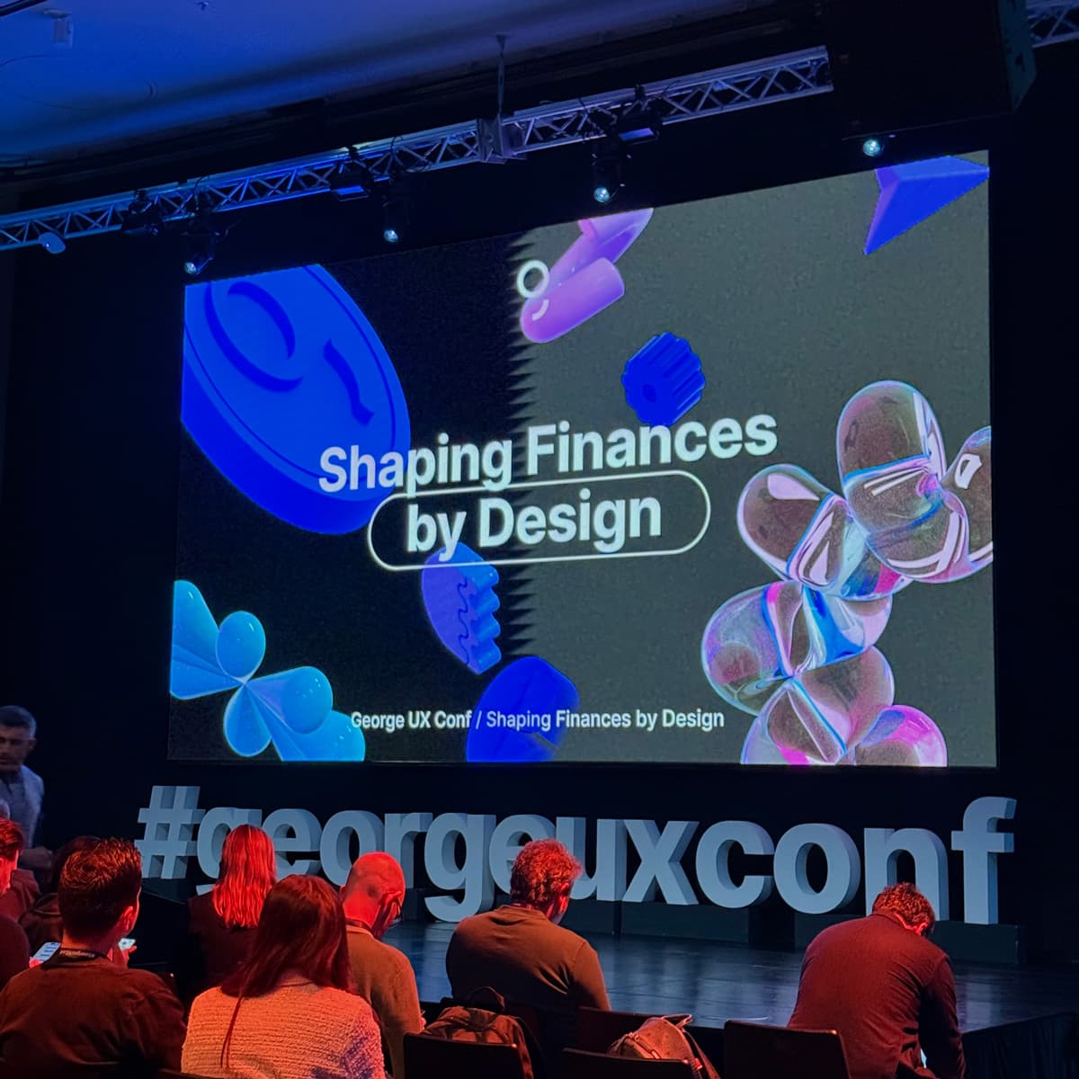
Report from George UX Conf: How Design is Changing the World of Finance

16. Jul 2020Design
In the beginning there was (almost) nothing. This is how the projects addressed to us by our clients start. In the meetings we encounter great ideas and courageous visions about a successful product.

Until this happens, we have a long way to go. From experience we know that reality laughs from the end of the street and looks forward to an early meeting. Let's look at the street where we are going to take a walk.
Before the designer starts to play with sexy pixels and colors, he has to overcome wild waters of tasks, jump through minefields of surprise, and avoid cross fire of feedback. Exactly. The relationship between the client and the designer is sometimes like a small war. Until we realize that we are not fighting against each other but together for a successful digital product. And it belongs to customers, users and those who pay for it.
Everyone who is working on a digital product should realize that all decisions are subjective unless they are based on at least the basic consumer survey. Being in the industry, talking to friends and inventing a product while drinking beer is a strong basis. It has only one potential problem. People like to surround themselves with similarly minded people with whom they feel good. However, the products are made for someone else and we want to get to know them.
The first step to a great product is a product analysis. We want to know the answers to several questions, such as: What problem will the product address? Who is the product intended for? How can we scale it? How will the product earn money? And last but not least, a very important issue for digital products: What product features will solve the given problem? Questions about the problem, functionality, and usage should be consulted with customers themselves.
We call this information insights and they are a great basis for creating the successful product. Then we put them into a meaningful document - a technical specification. The more sophisticated and detailed the specification, the better the designer and the developer can estimate and work on the project.
Based on this information, the designer can begin working on the design of a mobile or web application. The first phase of design proposals is chaotic, full of scrawled paper and pencil sharpener waste. Sketching helps detract from beautiful product and focus on functionality. The goal is to lay out all the functional elements at the right places, in a logical sequence of events to meet the requirements of good usability. We strive to create an effective and attractive experience for the user, so called User Experience (UX).
At this stage the communication between the designer and the client is very intense. Many of the functional and procedural issues that were not solved or emerged during work are fine-tuned.
The best sketches grow into digital ones, which are professionally called Wireframes. They are gray, without images or text, focused on functionality. However, digitization allows us to better understand how the product will be displayed on mobile or computer screens. With paper sketches it´s difficult to estimate how many words and elements will fit on the iPhone X or tiny iPhone SE screen.
We can connect these digital sketches to prototypes - simple product simulations. At this stage, the product begins to pick up real contours, and should be tested on a sample of 6-8 people from the target group and it is also important to consult the feasibility of the design with developers. By testing, we identify 80% of the imperfections, which are then improved in the final prototype.
Great specification, ongoing communication and patience bring the designer to the moment when he can start working on the visual side of the product. The product's visual interface, so called User Interface (UI), is directly influenced by the company's brand. It reflects the values defined in the brand or in the product. We talk about expressions like "youthful, bright, cheerful, courageous" vs. "stable, professional, trustful, adult". Based on these words you can already imagine the direction in which the visual will be taken.
Taking all the acquired information in the account, a full inspirational digital moodboard is created to show a visualization of the entire product. Looking at it, the client should see and feel his dream product. Designer considers dozens of variants and combinations during user interface creation process. He works with sizes, colors, shades, transparency, ratios, icons, photos, fonts, line thickness, shadows, and many others. All elements affect each other and create one whole product.
UI is subjective and a matter of feeling. Every designer, product manager, developer, or user would suggest different elements. A little more here, a bit less there ... It's possible to play with details for weeks, but it's not good for product development.
We look at the final design from two points of view. The first, as mentioned above, is the emotional point of view. The first impression creates the feelings we want to control even in line with the brand of the product. The second point is based on the goals we want to achieve. The design should be first and foremost useful. This is mostly ensured in the UX design phase, but with the right UI design application, we can reinforce or weaken our intentions. Is it a sales channel? All right, Call-To-Action buttons will be noticeable. Do we need to present certain information? Okay, we'll use larger size, maybe add Bold.
Confused by the terms UX and UI design? Don't worry, we've prepared an article for you.
Product design is a dynamic thing. It changes with time, and so does our view of it. That's why it's good to further test your proposals with users. By testing the finished design, we get the most important information. Their feedback is very valuable. It is better to ask the opinion of 5 people than to spend 1000 hours rewriting your own ideas.
The next step is to evaluate the results and optimize the product to the final form. At this point, developers can begin to work on development.
So, we finally met the reality at the end of the street and we can laugh together. What are your experiences? What would you recommend to your clients?
Our newsletter will provide you with fresh news from our world. If you have any questions, don't hesitate to contact us.
Ciao


