Creating a state-of-the-art experience for Benu pharmacies
Driving sales and improving user experience: How we created an e-commerce app for the biggest pharmacy network in Central Europe.
Informations
- Client: BENU
- Project type: Native mobile apps for iOS and Android
- Services: IT/Business Analysis, UX/UI Design, Research, Usability Testing, iOS & Android Development
- Year: 2022 - Present
Intro
Nice to meet you... Again.
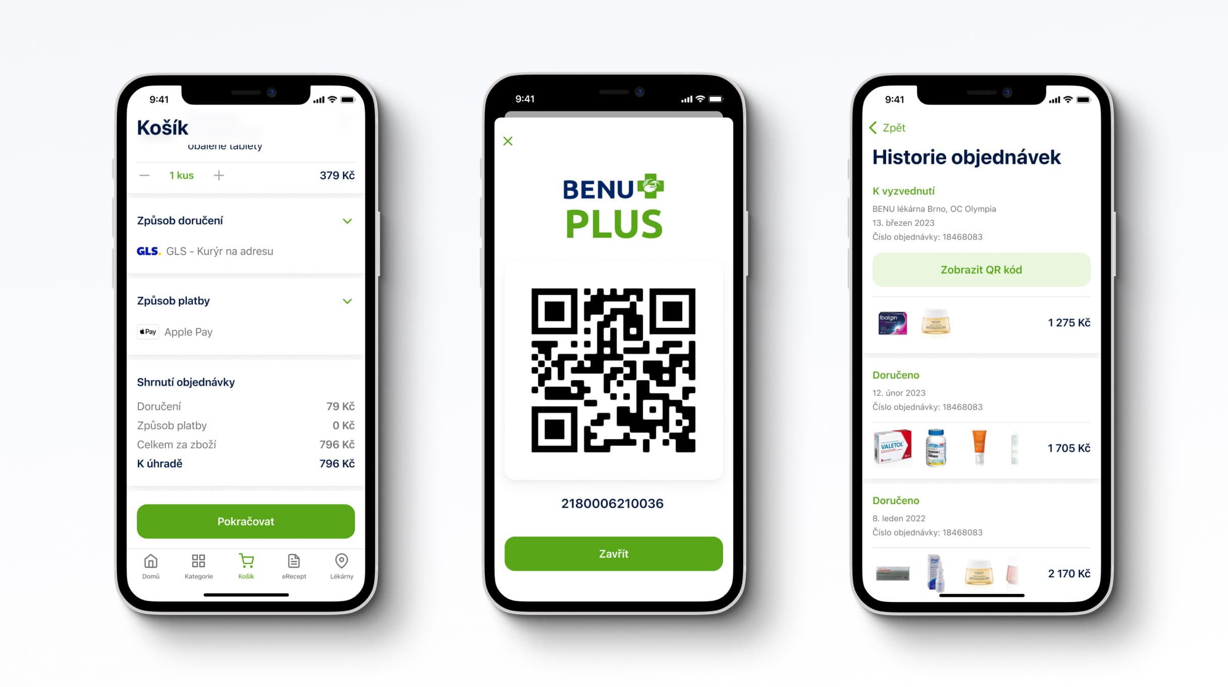
A few years ago, BENU approached us to take over the development of a mobile app that was nearing completion. After launching the app successfully, listening to customer feedback and collecting new ideas for the mobile app, we revisited our collaboration with an even more ambitious goal - implementing a robust e-commerce solution into the native apps and developing features that would help their customers manage their medication intake.
How it started
Defining the goals
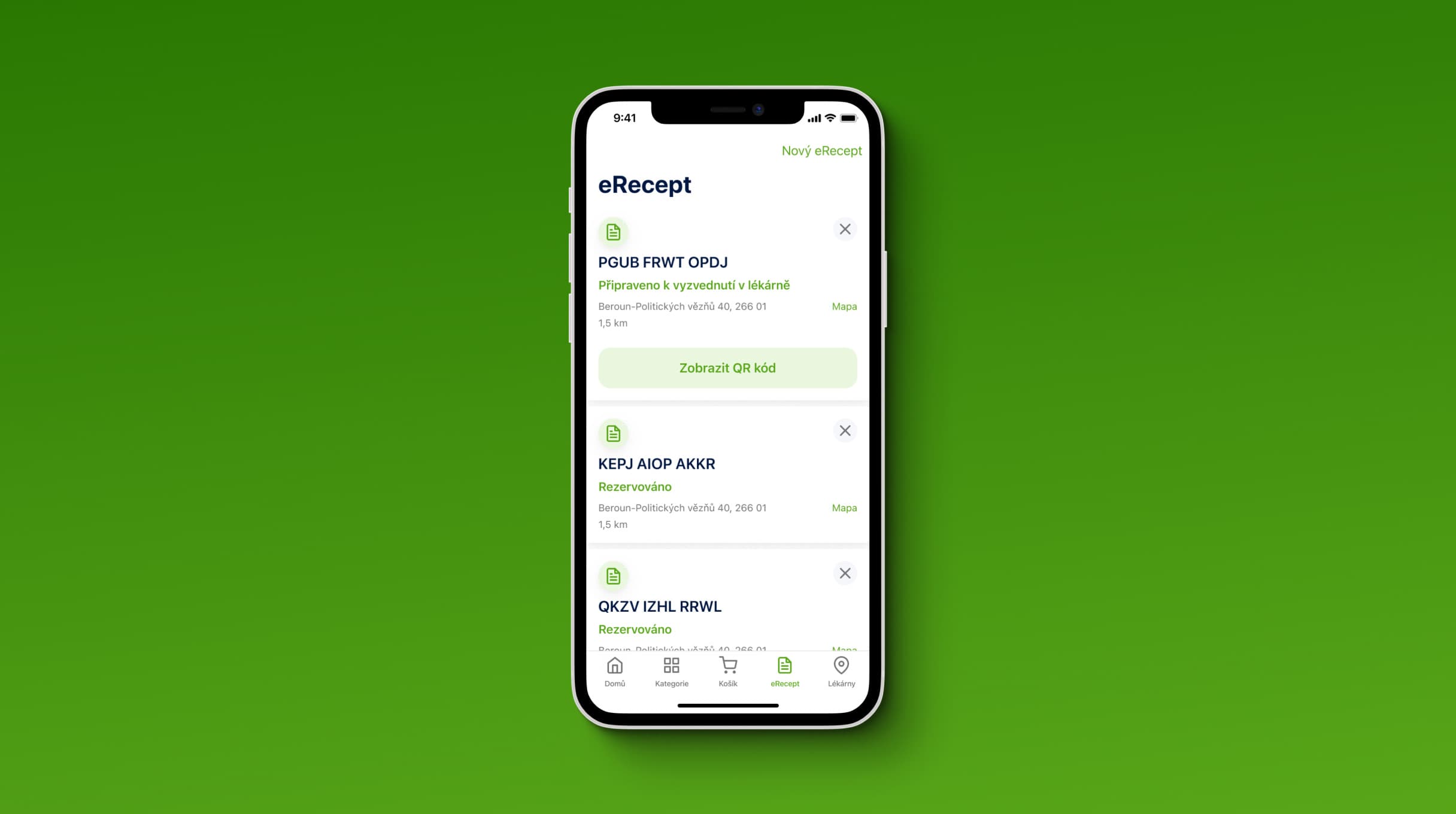
In partnership with BENU, we believed that empowering customers with the convenience of purchasing products and managing electronic drug prescriptions directly through the mobile app would not only elevate customer satisfaction but also drive a substantial surge in sales through digital channels for the client.
The users
Designing for a diverse customer base
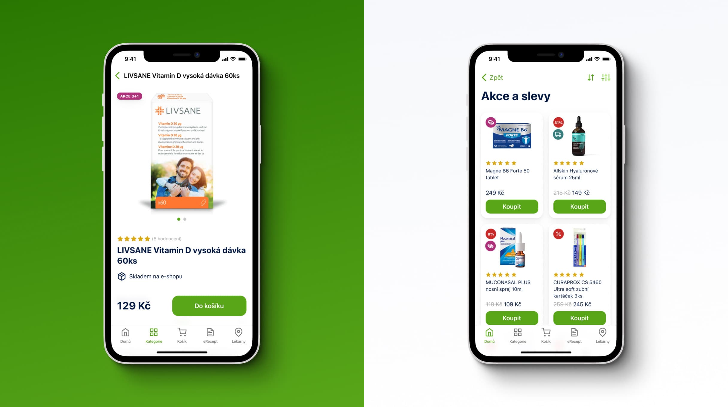
The customers of BENU are a large and diverse group, both in customer behaviour and demographic. Since BENU is the biggest pharmacy network in Central Europe, the user base we worked with included people in all walks of life, spanning from young parents, working professionals, people with disabilities and the elderly. This fact dictated our approach to designing the interface. We focused on helping the users execute complex flows in a few interactions and we aimed for the app to feel light and open, even though we worked with an unusually wide product catalogue on the background.
The opportunity
Creating a one-stop-shop for customers
When it comes to shopping for medication and medical devices, there was an opportunity on the market to provide a one-stop-shop for customers to buy products, manage electronic prescriptions, find nearby pharmacies and manage their medication intake. The new app allows people to have all their medication-related information in one place.
The design process
Crafting the solution
In the early stages of redesigning the mobile app, we embarked on a thorough exploration of different approaches. We pondered over the possibilities – should we preserve parts of the existing app and build new features on top, or would it be best to start fresh? Moreover, we needed to address essential technical updates in the codebase. These questions were crucial to shaping the structure and information architecture of the new product.
After conducting several workshops and discovery sessions with the client, we arrived at a well-informed decision. We chose to retain the existing features while incorporating fresh elements and wrap it all in a new visual design.
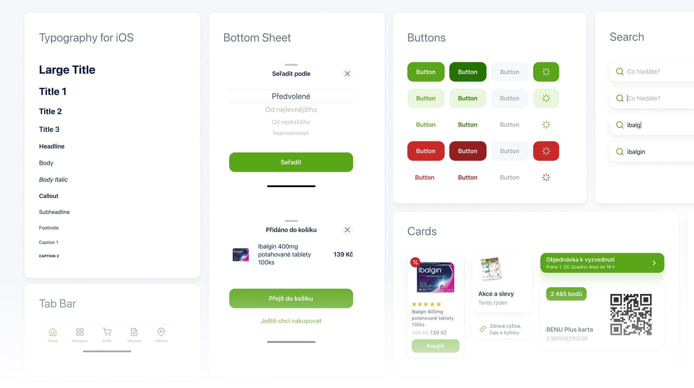
Once we had the final structure defined, we dived into designing solutions that would address user problems and opportunities. An iterative and intensive collaboration with our client led to the creation of a design prototype, supported by a custom, scalable design library.
Usability testing
Challenging our assumptions
After creating the new design, we needed to ensure that it was fine-tuned and error-free. Additionally, while designing buying flows, we created two different variants and were unsure which flow performed better. Therefore, the next step was to have users try out the new design, analyze their experience and obtain the necessary insights. We created a functional prototype of the new design that simulated the standard use of an app and planned the user research.
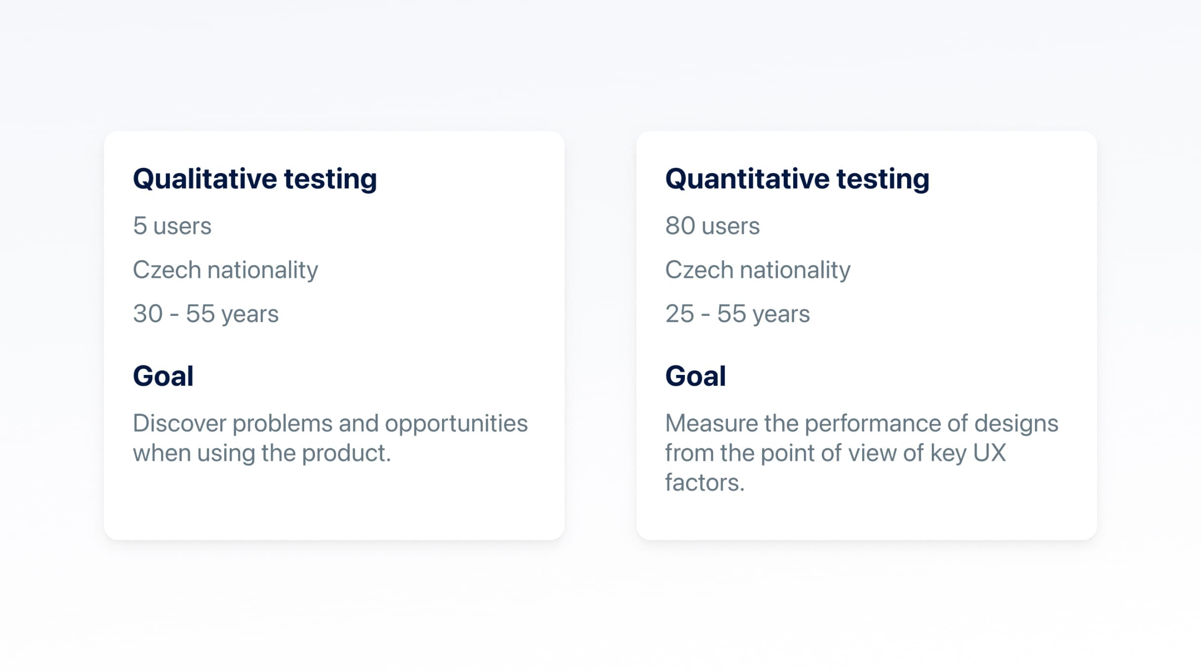
The first goal of user research was to find out whether the new design is easy to use and has satisfying user experience. The ideal method for this is to conduct qualitative user testing with five users. This allows us to observe users as they interact with the prototype, accomplish their goals, and provide their reactions and feedback. According to the data, we selected pharmacy customers who are mostly between 25 and 55 years old and have Czech nationality. This method can identify over 80% of the usability issues with the design that affect a third of users.
The qualitative testings provided us around 120 user insights about user behaviour, positive reactions, problems and tips for improvement. Since the deadline to create the first version of the application was near, we needed to prioritize the findings based on what we could implement in a short period of time. In the end, we end up with 3 “low hanging fruit” areas of improvement that provided big value for the user experience and were easy to implement.
Improvement#1
Enhance the user experience during the consent process for data processing to boost the number of consent conversions

Improvement#2
Optimize communication and presentation of special offers and discount items to increase sales conversion

Improvement#3
Revamp the visual design and copywriting on success screens to enhance user satisfaction and engagement

The second objective of user research was to determine which of the two product purchase flows had better UX performance. The ideal research method for evaluating performance in this case is quantitative testing. If done right, the method provides insight to crucial UX metrics such as average duration of doing a task, average user satisfaction and average time spent on screen.
To test out the UX performance between 2 product purchase flows, we used Maze, a research tool where we created separate functional prototypes for each flow, formed a single uniform testing script with tasks and evaluative questions and recruited 40 respondents for each flow. When the results came in, we were focused on how fast and easy was to reach the primary goal of the script - a successful order - between the 2 product purchase flows. The results were more than interesting. We found out that:
- The average duration of a successfully completed order for the painkiller pack in Flow B was 26% shorter compared to Flow A.
- The average time spent on screen during the order of the painkiller pack in Flow B was 36% shorter compared to Flow A
- On a scale from 1 (low satisfaction) to 5 (high satisfaction), the average user satisfaction in Flow B was 0.2 higher than in Flow A.
The results of quantitative testing showed that Flow B was significantly faster and slightly more preferred among users. These results influenced the final decision to develop the product purchase Flow B.
The development
Modernizing the tech in the background
On the development front, we implemented some significant updates. The entire app underwent migration to a new API, while Jetpack Compose on Android added enhanced functionality. We also integrated the Luigi's Box search solution and crafted a technical specification, effectively bridging the design and backend aspects. The result: clear and detailed materials that developers and testers could seamlessly work with.
Outro
A rewarding collaboration
The journey of working closely with BENU on this project proved both rewarding and challenging. Right from the outset, we sensed a genuine commitment from the client to do things the right way, embrace our expertise, and above all, listen to feedback from real users. This shared dedication acted as our guiding star, steering the entire project team towards a clear goal – to craft an exceptional experience for app users.
